10 Website Design Mistakes That Lose Customers
Small design mistakes can quietly cost a business real customers. Here are ten of the most common issues and how to fix each one.
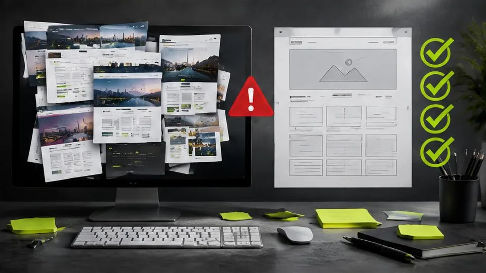
Some website mistakes are obvious the moment you see them. Others are subtle enough that a business owner can look at their own site every day and not notice what's quietly pushing customers away. Here are ten of the most common issues, and what to do about each.
1. Hidden or hard-to-find contact information
If a visitor has to hunt for your phone number or address, many simply won't bother. Contact details should be visible in the header or a persistent location, not buried only on a separate contact page.
2. Cluttered layouts with too many competing messages
A homepage trying to say everything at once — every service, every promotion, every announcement — overwhelms visitors rather than guiding them. Prioritize the one or two things you most want a visitor to understand and act on.
3. Slow loading pages
Every extra second of load time increases the chance a visitor leaves before the page even finishes rendering. Large unoptimized images and excessive scripts are common culprits. See how to speed up your website for specific fixes.
4. Poor mobile experience
Tiny text, awkward tap targets, and layouts that require horizontal scrolling all frustrate the majority of visitors who now browse on phones. A genuinely mobile friendly website isn't optional anymore.
5. Unclear or missing calls to action
Visitors shouldn't have to guess what to do next. If a page doesn't clearly direct them toward booking, calling, or buying, even interested visitors may simply leave without acting.
6. Outdated or inconsistent information
Old hours, discontinued services, or outdated photos erode trust quickly. An outdated-looking website can make even a well-run business look neglected to a new visitor.
7. Too many steps to complete a simple action
Long forms, unnecessary account creation steps, or confusing checkout processes all add friction. Each extra step loses a percentage of visitors who would have otherwise converted.
8. Stock photography that feels generic
Generic stock images of unrelated people or offices can make a business feel impersonal or even slightly dishonest, especially for service businesses where customers want a sense of who they're working with. Real photos, even simple ones, usually build more trust.
9. No clear indication of what makes you different
If your website could apply to any competitor with a quick find-and-replace of your business name, visitors have no reason to choose you specifically. Being specific about what you actually offer and how you work matters more than generic claims of quality or experience.
10. Neglecting the website after launch
A site that's never updated gradually falls behind: broken links accumulate, content goes stale, and security risks increase. Ongoing website maintenance prevents small issues from becoming bigger ones.
How to catch these on your own site
Because business owners know their own website intimately, it's easy to overlook mistakes that would immediately confuse a first-time visitor. Watching someone unfamiliar with your business try to use the site — find a service, check pricing information, or attempt to contact you — often reveals problems you'd stopped noticing.
Fixing what you find
Many of these mistakes can be addressed individually without a full rebuild: shortening a form, moving your phone number to a more visible spot, replacing a stock photo with a real one. Others, especially outdated structure or design across the whole site, are better addressed through a complete website redesign rather than a series of patches.
If you want an outside perspective on which of these issues apply to your own website, and which ones are actually costing you customers versus which are minor, ForYourWeb's web design service can provide a clear, specific review rather than a generic checklist.
A quick self-audit checklist
Before assuming your site is fine, check each of these honestly:
- Can a new visitor find your phone number within a few seconds
- Does the homepage focus on one or two clear messages, not a dozen
- Does the site load quickly on mobile data
- Is there a clear next step on every important page
- Is all the information, including hours and services, currently accurate
- Do forms ask for the minimum information needed to get started
Example: small mistakes, compounding effect
A single issue, like a slightly cluttered homepage, might not sink a website on its own. But combine a cluttered layout with a slow-loading image gallery, an outdated phone number in the footer, and a contact form that asks ten questions, and visitors face friction at every single stage of their visit. Individually minor issues add up into a site that quietly loses far more customers than any one mistake would suggest.
Questions to ask yourself about your own website
- When did we last look at this site the way a brand-new visitor would, rather than as the people who built it
- Which page gets the most traffic, and does that specific page clearly state what to do next
- Are there any claims, prices, or details on the site that are currently out of date
- If a competitor's website looked exactly like ours, would we still choose to work with us over them
How to prioritize fixes
Not every mistake deserves equal urgency. Start with issues that affect every visitor on every page, such as slow loading or hidden contact details, since fixing these has the broadest impact. Then address page-specific issues, like a confusing layout on one particular service page. Issues tied to an outdated overall structure, rather than isolated details, are the clearest sign that a full website redesign will serve you better than a series of individual patches.
A note on consistency across pages
It's common for only a few pages of a website to have been carefully built, while others were added quickly and never revisited. Checking that every important page, not just the homepage, meets the same basic standard for clarity, speed, and mobile usability catches mistakes that a homepage-only review would miss.
Frequently asked questions
Which website design mistake is the most damaging?
There's no single worst mistake, but hidden or unclear contact information tends to directly cost the most customers, since it stops interested visitors from ever reaching out.
Can these mistakes hurt my search rankings too?
Several of them, particularly slow loading and poor mobile usability, directly affect SEO, not just visitor experience.
How do I know if my website has these issues?
Review it honestly as a first-time visitor would, or ask someone unfamiliar with your business to try using it and watch where they struggle.
Do these mistakes mean I need a full redesign?
Not always. Many of these issues can be fixed individually. A full redesign is more appropriate when several issues stem from an outdated overall structure.
Related articles

How to Improve Your Website's Conversion Rate
Traffic alone doesn't grow a business — conversions do. Here's a practical breakdown of how to improve your website's conversion rate.
October 10, 2026
Why Your Business Website Is Not Generating Leads
A website that gets visitors but no enquiries usually has a specific, fixable problem. Here's how to diagnose why yours isn't converting.
October 10, 2026
Mobile-Friendly Website Design: Why It Matters
Most visitors now browse on phones, so a mobile friendly website isn't optional. Here's what it actually means and how to get there.
October 10, 2026