Mobile-Friendly Website Design: Why It Matters
Most visitors now browse on phones, so a mobile friendly website isn't optional. Here's what it actually means and how to get there.
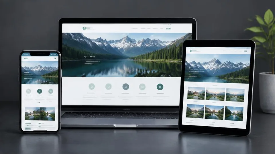
More than half of web traffic for most small businesses now comes from phones, not desktop computers. If someone searches for your restaurant, clinic, or shop on their phone and lands on a site that's hard to read or slow to load, they leave within seconds. A mobile friendly website is simply one that works well on that small screen, and today it's the baseline expectation, not a bonus feature.
What "mobile friendly" actually means
A mobile friendly website goes beyond "it doesn't look broken on a phone." It means:
- Text is readable without pinching to zoom
- Buttons and links are large enough to tap accurately with a thumb
- Pages load quickly on mobile data, not just office Wi-Fi
- Menus collapse into a simple mobile navigation instead of a cramped desktop layout
- Forms, maps, and click-to-call buttons work smoothly on touchscreens
Most modern sites achieve this through responsive design, where one set of code adjusts automatically to the visitor's screen size, rather than maintaining separate desktop and mobile versions.
Why it matters for small businesses specifically
Local businesses feel the impact of a poor mobile experience more than most. Someone searching "dentist near me" or "flower shop open now" is almost always on a phone, often while out and about, and ready to act quickly. If your site is awkward to use in that moment, they'll tap back and call a competitor instead.
This connects directly to local SEO for small business: Google factors in mobile usability when deciding which local results to show, so a clunky mobile site can quietly cost you visibility as well as conversions.
Mobile friendliness affects your Google rankings
Google has used mobile-first indexing for years, meaning it primarily looks at the mobile version of your site to decide how to rank it, even for people searching on desktop. If your mobile experience is slow or broken, it can drag down your rankings across the board. This ties into page speed too, so if you haven't already, it's worth reading about how to speed up your website alongside mobile improvements, since the two usually go hand in hand.
Common mobile problems that quietly lose customers
- Tiny tap targets: buttons placed too close together cause mis-taps and frustration
- Pop-ups that cover the whole screen: especially ones that are hard to close on mobile
- Horizontal scrolling: a sign the layout wasn't properly adapted
- Slow image loading: large, unoptimized images that were fine on desktop broadband
- Forms that are painful to fill on a touchscreen: too many fields, no appropriate keyboard types (like a numeric pad for phone numbers)
Any one of these can be the reason a potential customer leaves before contacting you, which is a common thread in sites that are not generating leads.
How to check your own website
Start simple: open your site on your own phone, using mobile data rather than Wi-Fi, and try to do what a customer would do — find your hours, call you, or request a quote. Note anywhere you hesitate or have to zoom in. Then check Google Search Console's mobile usability report, which flags specific technical issues like text too small to read or clickable elements too close together.
Fixing a non-mobile-friendly site
For a site with only minor issues, a developer may be able to adjust spacing, font sizes, and navigation without starting over. But if your website was built years ago on an old template, or was designed only with desktop in mind, patching it usually isn't cost-effective. In that case, a proper website redesign built mobile-first tends to deliver a better result and save money compared with repeated fixes.
When planning a new build or redesign, treat mobile as the primary version of your site, not an afterthought you test at the end. That shift in approach, more than any single technical trick, is what separates sites that convert well on phones from ones that merely display correctly.
Mobile friendliness is part of a bigger picture
A mobile friendly website works best alongside solid SEO for your small business website and a clear path to contact you. If you're unsure where your site currently stands, a web design consultation can assess both the technical and the user-experience side together, rather than treating mobile as an isolated checklist item.
Ultimately, mobile friendliness isn't about chasing a Google checkbox — it's about meeting customers where they already are. Get that right and the rankings tend to follow.
A practical mobile audit checklist
Work through this list on your own phone before asking anyone else to look at your site:
- Does the homepage load in a few seconds on mobile data, not just Wi-Fi
- Can you read body text without zooming in
- Are buttons and links spaced far enough apart to tap confidently
- Does tapping your phone number actually start a call
- Does your address open correctly in a maps app
- Can you submit your contact form without the keyboard covering the submit button
- Does the navigation menu open and close smoothly
- Do images and galleries resize properly instead of overflowing the screen
If you answer no to more than one or two of these, mobile usability is likely costing you enquiries, not just rankings.
Example: two businesses, two outcomes
Picture a salon whose desktop site looks polished but was never tested on a phone. The booking button sits below a large banner image that takes several seconds to load, and the phone number is an image rather than clickable text. A customer searching on their lunch break gives up and books with a competitor whose number they can tap directly.
Now picture a similar salon whose site loads fast, shows a sticky "Call Now" button on mobile, and keeps forms short. The second salon captures bookings from the exact same search intent that the first one lost. The difference isn't the service on offer — it's whether the mobile experience got out of the customer's way.
Questions to ask a developer or agency
- Is the site built mobile-first, or is mobile treated as an adjustment after the desktop design is done
- How will tap targets, font sizes, and image loading be tested before launch
- Will click-to-call and map links be tested on actual devices, not just a browser's resize tool
- How will mobile performance be monitored after launch, not just at delivery
Mistakes businesses make when trying to fix mobile issues themselves
- Shrinking desktop fonts slightly and assuming that counts as mobile friendly
- Hiding content on mobile instead of genuinely restructuring the layout
- Adding a mobile pop-up or app banner that covers the content it's meant to promote
- Testing only on one device or one browser, then assuming the whole site behaves the same everywhere
Avoiding these shortcuts is usually less work in the long run than patching around them repeatedly.
Frequently asked questions
Is mobile-friendly the same as responsive design?
Responsive design is the most common way to achieve a mobile friendly website. It means the layout adapts to any screen size, but mobile friendliness also covers speed, tap targets, and readability.
How do I check if my website is mobile friendly?
Open it on a real phone and try completing a key task, such as calling your business or filling a form. You can also use Google Search Console's mobile usability report for technical issues.
Does a mobile friendly website cost more to build?
Not inherently. Most modern website builds are mobile first by default, so the extra cost usually comes from custom interactions rather than basic responsiveness.
Can an old website be made mobile friendly without rebuilding it?
Sometimes small adjustments help, but sites built years ago on rigid templates often need a proper redesign to work well on phones.
Related articles

How to Make Your Website Load Faster
A slow website costs you visitors and rankings. Here are the practical, high-impact fixes that actually speed up website load times.
October 10, 2026
Website SEO Checklist: How to Optimize Your Business Website
This website SEO checklist breaks optimization into on-page, technical, and local factors so you can work through it systematically.
October 10, 2026
How to Improve Your Website's Conversion Rate
Traffic alone doesn't grow a business — conversions do. Here's a practical breakdown of how to improve your website's conversion rate.
October 10, 2026