How to Improve Your Website's Conversion Rate
Traffic alone doesn't grow a business — conversions do. Here's a practical breakdown of how to improve your website's conversion rate.
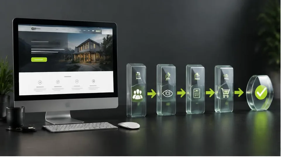
Your conversion rate is the percentage of visitors who take the action you want — booking an appointment, making a purchase, submitting a form. A website can have plenty of traffic and still perform poorly if that traffic doesn't convert. Improving conversion rate is often more valuable, and more achievable, than simply chasing more visitors.
Start with clarity, not decoration
The most common reason visitors leave without acting isn't a lack of visual polish — it's confusion. Within a few seconds, a visitor should understand what you offer, who it's for, and what to do next. If your homepage opens with vague language or buries your main offer under too many competing messages, visitors disengage before reaching your call to action.
This is one of the recurring issues behind a website not generating leads despite reasonable traffic — the problem usually isn't visibility, it's clarity once someone arrives.
Make your calls to action unmistakable
Every key page should have one clear, primary action you want the visitor to take. Avoid competing calls to action that split attention, like three different buttons leading to three different next steps on the same page. Use direct, specific language — "Book a Consultation" tells a visitor more than a generic "Submit."
Placement matters too. Important calls to action shouldn't require significant scrolling to find, and should reappear at natural points as the visitor reads further down a longer page.
Remove friction wherever you can
Every extra step, field, or decision point is a chance for a visitor to abandon the process. Review your forms and checkout flows and ask honestly whether each field is necessary. A contact form asking for ten pieces of information before someone can simply ask a question will lose people who'd have converted with a shorter version.
Speed and mobile experience directly affect conversions
A slow-loading page or an awkward mobile layout causes visitors to leave before they ever reach your offer, regardless of how compelling it is. If you haven't already addressed this, reviewing how to speed up your website and ensuring it's genuinely mobile friendly are often the highest-leverage conversion fixes available, because they affect every visitor on every page.
Build trust signals into the page
Visitors who are unsure about a business often leave rather than risk a bad decision. Clear contact information, real photos of your work or location, straightforward policies, and genuine customer feedback all reduce hesitation. Avoid anything that feels exaggerated or vague — specific, honest information consistently builds more trust than generic claims.
Common conversion-killing mistakes
- Asking for too much information too soon
- Burying contact details or making visitors search for how to reach you
- Inconsistent messaging between an ad or search result and the page it leads to
- Cluttered layouts that distract from the main action, a pattern covered further in website design mistakes
- No clear next step at the end of a page, leaving visitors unsure what to do
Test, measure, and adjust
Conversion improvement isn't a one-time fix — it's an ongoing process of noticing where visitors drop off and adjusting. Simple changes, like rewording a call to action or shortening a form, can sometimes produce a disproportionately large improvement. Where possible, test changes gradually rather than overhauling everything at once, so you can tell what actually worked.
Getting outside perspective
It's genuinely difficult to see your own website the way a first-time visitor does, since you already know what you're offering and how to navigate it. A fresh review through ForYourWeb's web design service, or a focused website redesign if the issues run deeper, can identify friction points you've stopped noticing and turn existing traffic into meaningfully more enquiries and sales.
A practical conversion audit checklist
Go through your key pages and check each of these:
- Is the main offer and next step clear within the first few seconds of landing on the page
- Is there one obvious primary call to action, not several competing ones
- Does the contact or booking form ask only for what's truly necessary
- Does the page load quickly and display properly on a phone
- Is contact information visible without scrolling or searching
- Are there genuine trust signals, like real photos or specific details about your service
Example: a small change with an outsized effect
A local clinic's contact form originally asked for ten fields, including insurance details that weren't needed until a confirmed appointment. After trimming the form down to name, phone number, and preferred time, more visitors completed it, simply because the remaining steps asked less of someone who was still deciding whether to commit. No other part of the page changed. This is a common pattern: the layout and colors matter less than how much effort a visitor has to put in before they get value back.
Questions to ask when reviewing your own site
- If I were a new visitor who knew nothing about this business, would I understand what to do within a few seconds
- Are we asking for information before earning the visitor's trust, or after
- Does every page have a clear next step, or does it just end
- Are we sending traffic to pages that actually match what was promised in the ad or search result
Mistakes to avoid when trying to improve conversions
- Changing many things on a page at once, making it impossible to tell what actually helped
- Adding more calls to action in hopes one will work, rather than clarifying the one that matters most
- Focusing only on visual design while ignoring load speed and mobile usability, which affect every visitor regardless of how the page looks
- Assuming a redesign alone will fix conversion issues without addressing the underlying clarity and friction problems first
Keep expectations realistic
Conversion improvements rarely come from one dramatic overhaul. More often, a series of smaller, deliberate changes compound into a meaningfully better result over a few months. Setting a realistic expectation for that pace helps avoid abandoning a genuinely good change too early, simply because it didn't produce an instant jump in enquiries.
Frequently asked questions
What is a good conversion rate for a small business website?
It varies widely by industry and goal, so comparing against a generic average isn't very useful. Tracking your own rate over time and improving it steadily matters more than hitting a specific benchmark.
Does more traffic automatically mean more conversions?
Not necessarily. If your site has usability or trust issues, more visitors simply means more people leaving without acting. Fixing conversion issues often has a bigger impact than driving more traffic to a weak page.
What's the single biggest factor in conversion rate?
There isn't one universal answer, but clarity consistently matters most — visitors need to immediately understand what you offer and what to do next.
Should I test changes before rolling them out fully?
Where possible, yes. Testing a change with a portion of visitors before fully committing helps avoid accidentally reducing conversions based on a guess.
Related articles
Why Your Business Website Is Not Generating Leads
A website that gets visitors but no enquiries usually has a specific, fixable problem. Here's how to diagnose why yours isn't converting.
October 10, 2026
10 Website Design Mistakes That Lose Customers
Small design mistakes can quietly cost a business real customers. Here are ten of the most common issues and how to fix each one.
October 10, 2026
Landing Page vs. Website: What's the Difference?
A landing page and a full website serve different purposes. Here's how to tell them apart and which one fits your current goal.
October 10, 2026